Remotely Brand Guidelines
Looking to reference Remotely? Below you can find all of the Remotely brand assets as well as rules that help outline how to best use our assets.
Logo
The Logo
With the Remotely logo being the pillar of our brand, we want to ensure that when used it meets the standards of our design team. The logo is comprised of two elements: the icon and the text.

The Icon
The icon is the most commonly used element of the Remotely logo. It can be found in black and white as well as color-Remotely's website header, letterhead, social accounts, and other areas where the brand has been defined.
![]()
Spacing
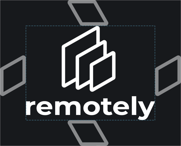
To ensure that the icon and logo are prominent, we require minimum spacing the width of the smallest diamond in the logo. This ensures that the logo is clear and legible.

Icon Spacing
We follow the same rule with spacing around the icon by ensuring that the minimum width applied around the icon is that of the smallest diamond.
![]()
Colors
Our color palette is geared towards the system administrator who is constantly staring at a field of screens. Our goal when creating the color palette was to create something that is sleek, bold, yet refrains from strain on the eyes or visual vibration.
Base Colors
Our base colors are kept as simplistic as possible by using a basic color palette of dark grey and pure white.


Corresponding Base Colors
We understand that some palettes may not support our base colors. We have created corresponding colors to satisfy these scenarios.


Primary Colors


Secondary Colors


.png?width=50&height=50&name=Untitled%20(50%20%C3%97%2050%20px).png)